From Local Trademark to Global Brand – Brand and Marketing in Continental’s History
A symbol can be found everywhere at Continental – on the products, the employee magazine, advertising brochures or the annual report: The jumping horse, whether as a logo combined with the Continental logotype, or as an icon, framed in two circles with the logotype “Continental – Since 1871”. On a specialist brochure in 1875, a veterinarian from Hanover used this symbol for the first time. In this brochure he described his latest invention: hoof buffers made of soft rubber for horses. At the time, this invention was a minor sensation. At a time when horses still played an important role in mobility, it provided a remedy for various problems: Thanks to the hoof buffers, there were fewer malformations on the hooves of the horses. They also protected against injuries and increased the horse’s sure-footedness on smooth surfaces. The veterinarian had developed these hoof buffers in cooperation with Continental, with the company also organizing the production and distribution. For this reason, all the hoof buffers produced were marked with the jumping horse as a trademark. In the spring of 1876, Continental finally applied to the Hanover Regional Court for the brand for horse hoof buffers made of rubber. From this point on, the trademark was gradually used for other Continental products and registered in October 1882 for all soft rubber products. Twelve years later, Continental finally had the trademark protected throughout Germany. As a result, the jumping horse was now an integral part of Continental’s external image.
For the choice of the horse as a trademark, two facts in particular played an important role, besides the hoof buffers: Firstly, the horse had a long tradition in the Hanover region, secondly, it had been known and spread as a political symbol for centuries. Since the early Middle Ages, numerous rulers have featured the horse in their coats of arms. Even today, the horse is still part of the Lower Saxon coat of arms. The use of the jumping horse on the early Continental products thus stood not only for quality, but also for the regionality of the products.
In addition, the use of a uniform symbol created a great recognition value for the brand. This was important in order to be recognized as a company and to differentiate itself from competitors. For this reason, the horse was also used intensively in the advertising of Continental products and was always taken into account in all realignments of the brand and the company.
The Continental color and brand strategy
In addition to the name “Continental” and the horse, color is also an essential element of the company’s identity. Since 1907, all advertising posters of the company have been maintained in blue and yellow, thereby shaping the external presentation of the company and its products. From May 1934, these colors were also registered as part of the brand and thus protected by trademark law.
This color scheme remained unchanged until 1977, before a fundamental revision of the entire brand identity followed. During the course of this, a detailed and binding company-wide directive on the use of logotype and icon was created for the first time. This fixed logo still characterizes Continental’s brand identity today. With the revision of the logo, the established color scheme was also adjusted: From then on, a warm, bright yellow shaped the identity of the company.
When Continental developed from a one-brand company to a multi-brand group of companies in the course of the 1980s through various mergers, the color scheme was temporarily changed. The goal: to separate the Continental Group in its external appearance from the traditional tire brand. The Annual General Meeting at that time therefore opted for a new type design in the colors turquoise and green. However, as early as 1997, this separation between Continental Group and the product brands was reversed, and the yellow color scheme was revived as a central element.
Echo Continental as an advertising medium
Advertising has always played an important role for Continental. The company used numerous media and formats to promote its products: from newspaper ads to house facades, cycling jerseys and postcards to the first cartoons, everything was represented. One of the most popular advertising media was certainly the customer magazine Echo Continental, which appeared between 1913 and 1941, first monthly and then quarterly. From an initial 241 issues, circulation quickly rose to over 100,000 copies in the 1930s. A separate editorial team within the Continental advertising department put together the issues and commissioned some renowned advertising graphic artists, writers and photographers of the time for the content.
An important element for the success of the magazine was, in particular, its comprehensive sports coverage. From football and tennis, to the early automobile races and bicycle races, to the first competitions in the field of aviation, everything was illustrated with photos in the Echo Continental. For each report, the editors noted which Continental products were used in the competitions and which solutions the company had in its range for the relevant sport. This was of great importance to the company, as consumer goods accounted for a large part of total sales. Advertising therefore documented extensively the occasions on which Continental products had proven themselves in competitive situations. Amateurs were also convinced of the quality of tennis balls, football bladders or bicycle tires.
In the 1920s, women also played a key role in Echo Continental articles: The magazine reported, for example, how women were becoming increasingly active in sports and the automotive world. The image of women outlined here was very progressive for the time. Almost every issue included articles with references explicitly addressed to women. Information about the driving license process and technical information about cars were explicitly to motivate women to put themselves behind the wheel. In this way, mastering a car became a prerequisite for the emancipation, self-determination and independence of women. In addition, the authors of Echo Continental made it clear during these years that female drivers were not simply seen as potential customers for tires or fashionable rubber clothing. Mobility was for Continental also a service to society and the emancipated woman was the stated goal. Well-known female drivers as brand ambassadors also underscored this attitude. These included, for example, female participants who owned their own cars and drove them themselves, professional racers such as Hanni Köhler, the founders of the German Women’s Automobile Club e. V. or Luise Otto, Germany’s first female driving instructor.
However, beyond rubber products, Continental saw itself not only as a pioneer of mobility, freedom and emancipation for women, but also for society as a whole. After all, individual mobility was not yet affordable for large swathes of the population at that time. However, this changed with the ongoing progress made in tire technology. And so the car developed into a means of emancipation, just like the bicycle before it. The associated mobility and freedom to travel independently and individually were also an expression of social modernization. For Continental, this was a vision that was supported in a targeted way.
The customer magazine’s rise to one of the most important advertising formats was also thanks to its sense of humor. Between the reports, there were also frequent cartoons, some of them from well-known artists of the time. Between 1925 and 1929, for example, British cartoonist William Heath Robinson published a series of drawings in Echo Continental. Readers were provided with factual information on one page, together with the associated cartoon on the next page. Packaged in this funny context, this type of advertising was much more effective than a conventional ad in the same position.
Advertising figures
Over time, the Continental advertising department tried again and again to establish a popular advertising figure. However it only ever attained moderate success, and as a result the depictions often changed. The advertising figures designed included “Pneumos,” the protective spirit for drivers in need, and the character “Mr. Conti.” The latter was a tire with face, arms and legs that came to life and had a remarkable variety of costumes and abilities. For example, “Mr. Conti” gave readers useful information about Continental products during the cold season and always had the latest edition of the Continental Handbook ready.
Another advertising figure from Continental was a kind of vagrant or casual worker, reminiscent of the “tramp” character commonly used in the English-speaking world. It imparted freedom and independence from social conventions, offering customers a certain opportunity to identify with each other. For this reason, the figure was retained by Continental for a long time.
Modern advertising formats
What characterized mobility in the early 20th century was primarily poor roads and journeys within the immediate vicinity. Accordingly, there were hardly any signposts or information signs for drivers from outside the city on the roads. In addition, driving a car required considerable technical expertise. You had to be able to resolve any difficulties that arose while driving – from a flat tire to the adjustment of the engine or chassis. As more and more people dared to get behind the wheel over time, Continental decided to support this development with products and services. A comprehensive portfolio of advice literature was not only aimed at lowering the barriers to entry, but also at assisting drivers with various challenges. A large range of clothing, accessories and tools ensured the necessary equipment was available. In addition, Continental set up its own travel information system at its corporate headquarters in Hanover in 1911. Through the “Continental Touring Office,” touring motorists could have itineraries prepared and sent to them free of charge. Continental also tackled the inadequate signage for the road network independently, installing its own signposts without further ado. These signs were designed in a Continental color scheme and were used to advertise the company. In this way, Continental was able to position itself as a mobility service provider and holistic partner for drivers.
Another area in which Continental has been active since the 19th century and has advertised its own products is sport. As bicycles became increasingly popular in everyday life, cycling became increasingly important as well. Cycling tracks were built in many places. Numerous races were held on European roads. Continental also advertised there, through banners or cycling jerseys. The company supported both early stars in the cycling firmament, as well as amateur riders and competitions. With the increasing spread of the automobile, the Continental advertising department also discovered motor sports competitions as the ideal advertising medium for itself. In this way, the company has become a pioneer in modern sports marketing. The importance of racing as an advertising medium for Continental was maintained in the following years. Continental products were used in numerous car, bicycle and motorcycle races. In the 1954/55 season, Continental even equipped the first Mercedes Formula One vehicles with tires.
Conclusion
Throughout its 150-year history, Continental has designed a wide range of advertising activities. The style and media of this advertising not only reflect the company’s self-image, but were and continue to be a mirror of technical and social developments.
Historical Pictures

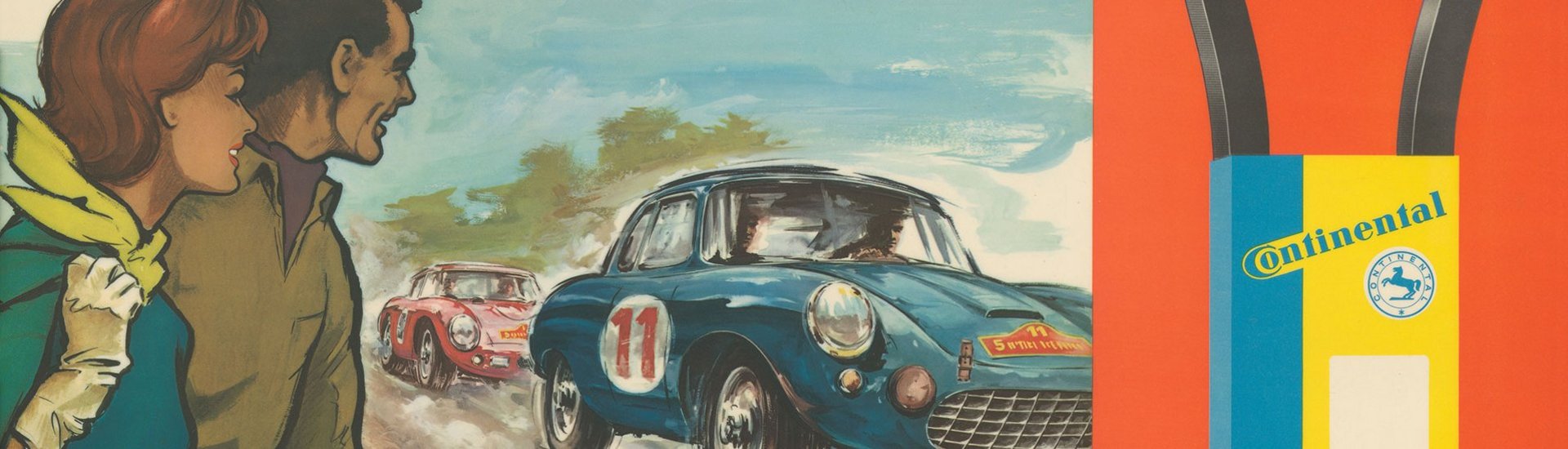
The picture shows an advertising poster for rubber V-belts from 1963. 
The picture shows an advertising postcard from 1904 with Continental banner advertising. 
The picture shows a tire prospectus from 1986. 
The picture shows the first appearance of “Mister Conti” in the January issue of “Echo Continental” from 1927. 
The picture shows an excerpt from “Echo Continental” from 1925. 
The picture shows an historical advertising flyer from around 1931. 
The picture of a woman in “Echo Continental” in October 1926.


